Menu Template:
Blue Onmouseover MenuFloating Menu Script With Close Button
This menu is generated by Vista JavaScript Menu.
Create your own menu now!

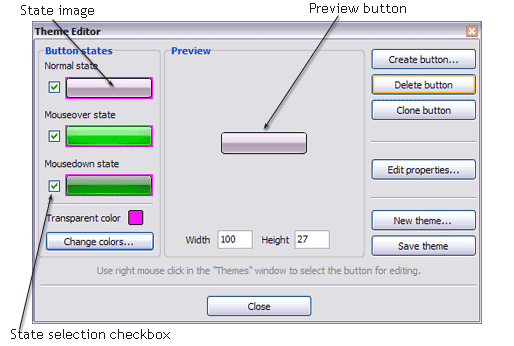
Create button... - to add new button to the current theme. After you click the "Create button" button, the "Create New Button" dialog will appear.
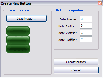
Load image - to open button states image file (*.bmp)
Total images - to define how many button state images are in the opened file. The button states image will then be divided into this number of state images.
State … offset fields - to set the state image for each Normal/Hot state of the button. If you set state offset to 0 then the topmost state image will be used for the state. If you set state offset to 1 then the second state image will be used etc. State 1 corresponds to the Normal state, state 2 - to the Hot state, state 3 - to the Pressed state.
Create button - to add the button to the current theme.
Delete button - to delete the button from the current theme.
Clone button - to create a copy of the button in the current theme.
Edit properties... - to edit the button state images' edge width. After you click the "Edit properties..." button, the "Button properties" toolbox will appear.
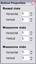
Horizontal and Vertical - to define edge width for each state. Edges are not scaled when you change the button size. Using edges is useful when you would like the button to have border. Then, if the border is within the edges, it won't be scaled.
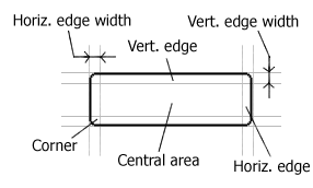
Central area is scaled in both directions. Corners are not scaled. Vertical edges are not scaled in vertical direction. That is, when you change the button height, vertical edges will not be scaled. And vice versa, horizontal edges are not scaled in horizontal direction.
Example: Let's say, we have the following button (size: 50x50):

Let's change it's width to 150:

As you can see, in the left image (Horiz. edge width = 1) whole button image was scaled to fit its new size. In the second case (Horiz. edge width = 10) left and right edges of the button were not scaled. Same with the vertical edge width.
Transparent Color - to set the transparent color. When you add new button, transparent color is automatically set to match the color of the top-left corner of the button states image.
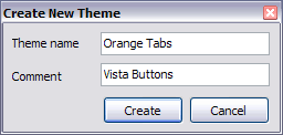
New theme... - to create a new theme. "Create New Theme" dialog will appear, where you should enter theme name and special notices (for example your copyright info, email, etc.).
Save theme - to save theme changes.
Close - to close Theme editor.
Change colors... - to exchange web button images colors. After clicking the "Color exchange" button, the "Color exchange" dialog will appear. Select the state(s) you want to be affected by clicking the checkbox next to the state image.
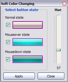
Move slider to find the color you like.
Wight and Height fields - to set the preview button size.
 (please include template name in the message title)